pamela,
or virtue rewarded
scroll
Strategy:
This project is my response to a brief that
required I produce a book typesetting text
that's out of copyright.
Pamela is pair of typographic artefacts
that explores the cultural context and reception
of romance novels since their inception,
with Samuel Richardson's Pamela, or
Virtue Rewarded.
Through their materiality
and use of typographic elements
and techniques, I hope to remind my
audience of the political complexity that
is inherent to romance and erotica, while
retaining a sense of playfulness and fun.
The piece's target audience is young
people who are interested in culture, and
gender politics, but who, like many of us,
may be experience fatigue in consuming
written and long form content.
Research:
Samuel Richardson's Pamela,
or Virtue Rewarded was my chosen text for
this task. Seen as the first ever romance
novel, and one of the first modern novels
ever, this epistolary text is comprised
of a series of letters between the titular
Pamela, a 15 year old working in a
manor house, and her parents.
Pamela is incessantly pursued by her lecherous
employer, who sexually harasses
and assaults her. Pamela refuses his
advances, preferring to maintain her virtue
and die, than bring shame to herself
and her family. The text's resolution sees
Pamela marry her tormentor, this event
being the supposed “reward” for her
staunch virtue. Intended as an instructional
guide for the “youth of both sexes”,
Pamela was an overnight success and
changed the course of literary history.
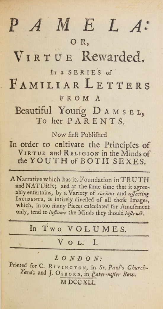
'Pamela', Samuel Richardson, first edition title page, 1740 click to read 'Pamela'
Research:
I conducted analysis of the text, focusing
not just on content, but style, and I
was surprised to find the language and
presentation of the story was highly
readable and compelling. While it was at
times completely abhorrent, and not at all
aligned to contemporary moral standards,
the writing in Pamela
maintains the wit, drama and histrionics that
made it so successful in its own time.
My overall sense when reading the text was,
“This is incredibly entertaining. I want everyone
to read this with me.” As this feeling
of excitement was my main take away
from the text itself, I wanted to be sure
that my verison of the text was attention
grabbing, and at some level, fun. Please
see my physical sketchbook for in depth
annotations and passage analysis.
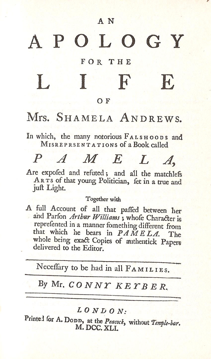
'Shamela', Henry Fielding, first edition title page, 1741 click to read 'Shamela'
Research:
My research began with the physicality
of the text's first edition. Samuel Richardson,
the author, was a printer by trade
and was initially commisioned to write
this text by the publisher he worked for.
There was immense backlash to Pamela
as well as a huge number of fans upon its
publication.
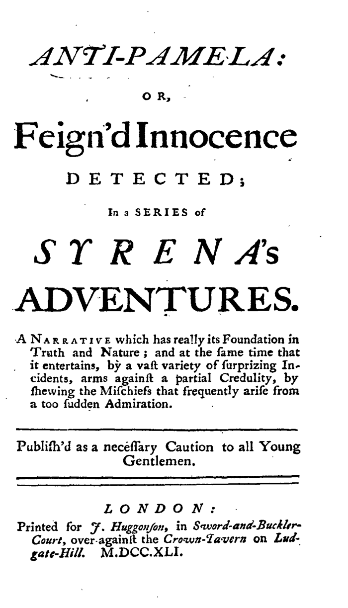
I was also inspired by the first
edition title pages of two texts written
in response to Pamela's popularity and
content - The Anti-Pamela or, Feign'd
Innocence Detected and
An Apology for the Life of Mrs. Shamela Andrews.
These pages were elegant and balanced while
also incredibly busy, and totally unlike the
printing we are accustomed to today. The
typefaces used on these title pages are
old-style serifs with an unruly but beautiful mix of
upper and lower-case glyphs,
romans and italics, strange ligatures and
s glyphs that look like f. The structure of
these pages will go on to inform my final
layout and typeset.
'Anti-Pamela', Eliza Haywood, first edition title page, 1741 click to read 'Anti-Pamela'
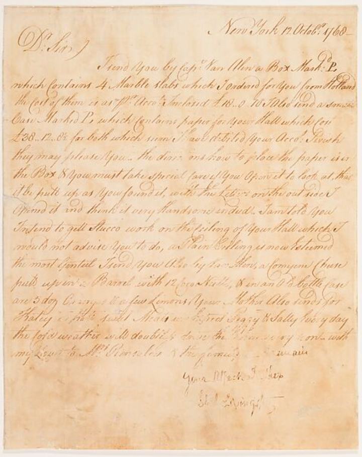
Research: As the novel is a series of letters, it made sense to me to look at examples of surviving letters from early 18th century. This example is housed at the Metropolitan Museum of Art in New York. Being hand written, these letters informed my attempts at devising a layout, rather than choice of a typeface.
'Plan, Letter, and Bill', Philip Livingston, parchment, 1768 click to visit the letter
Research:
My research turned then to the presentation
of romance, erotica and pornography
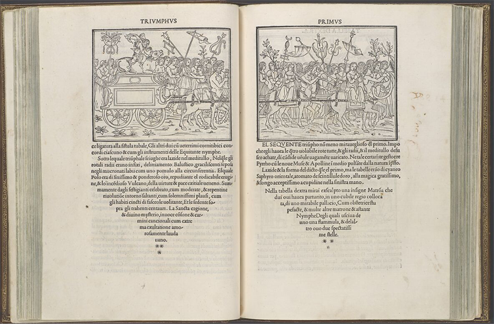
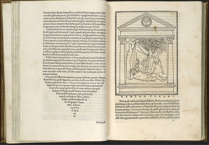
through time. Thus, the Hypnerotomachia
Poliphili, a colelction of erotic stories,
was another reference that I investigated.
This book was produced in 1499, printed
by Venetian publisher Aldus Manutius
and is incredibly strange and wonderful
in its use of form, layout and its marriage
of illustration and text.
The typeface used
here was designed by Francesco Griffo of
Bologna especially for this book and features
long ascenders and descenders, as
well as open counters that create a sense
of space and liveliness within the dense
blocks of text. The conical funnel shape
that the text blocks create is beautiful and
unexpected.
'Hypnerotomachia Poliphili', various makers, printed book, 1499 click to visit the HP
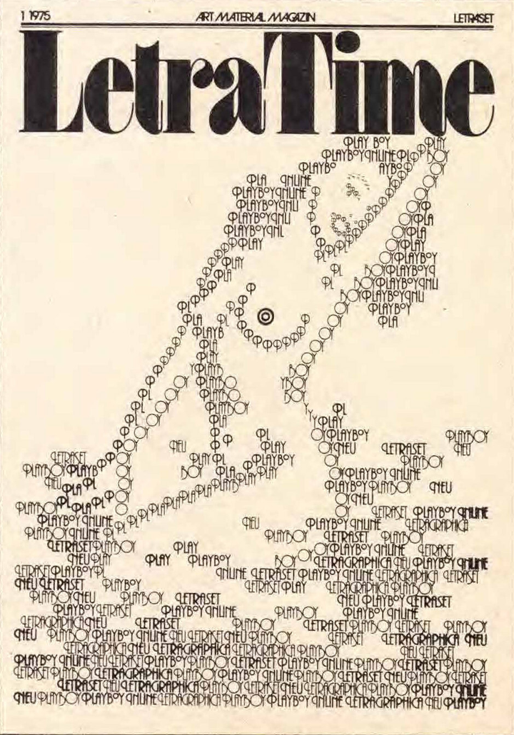
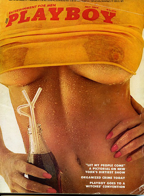
Research:
While looking at the presentation of
erotic content through time, I, of course,
explored Playboy Magazine.
This led
me to, not only some beautiful vintage
covers, but also this cover for
Letra Time.
This cover features the use of the typeface
Plaza, which was originally called
Playboy by Letraset. Designed by Christof Gassner,
it won ITC's first Internation
Upper and Lower Case Typographic
competition.
The second cover I have
included due to its application of type
onto a garment which is then photographed.
This is a technique that I have
explored in the past, and one I considered
at different points throughout this brief. I
was also interested in
Playboy Magazine
as a political space. The articles in these
magazines have always been politcal and
indicative of the cultural attitude towards
sex and gender norms. In some ways,
the social function of a publication like
Pamela, and one like
Playboy
are more closely related than you may think.
click to visit LetraTime Magazine cover, 1975 click to visit Playboy Magazine cover, July 1974
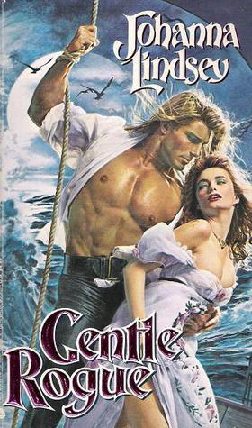
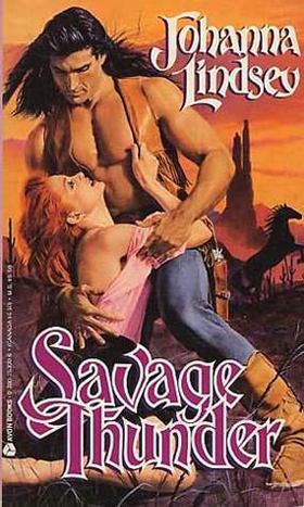
Research: In my research on romance novels as a genre, I wanted to pull out and reference the iconic Mills and Boon bodice-rippers of the 1980s. Italian model, Fabio Lazoni featured on countless of these covers, and I personally think they are some of the most wonderful book covers in history! Romance covers these days are very tame, and act as a kind of disguise for the content, so that anyone can read these books in public without fear of detection. I considered the materiality of these books as well, cheap paper backs whose spines crack and pages dog-ear at the first touch. Type in these books is usually large, set in Baskerville, Garamond or Caslon, and fully justified. They are often A5, quick reads made to be thrown in a handbag.
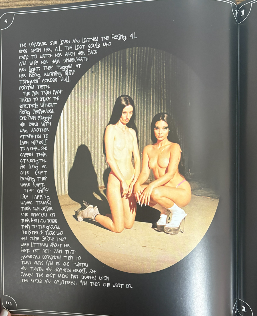
Research:
The last two references that I want to
highlight are young women who are
exploring the divide between art and
pornography in their work. The first of
these referencees is
Fairy Tales by Petra
Collins, phootgrapher, and Alexa Demie,
model and muse. Ostensibly a photography book,
this collaboration is structured
around a series of fairy tale retellings.
The typographic choices that the book
designer Sandra Leko made to handle
and balance type and photography are
simple and elegant. She uses wrapped
text, borders and illustrations to create
whimsy and structure around the images.
The script typeface that she uses is also
interesting, as it is very open, with all
caps, thin strokes and lots of negative
space. This negates some of the difficulties
that could be posed by the short line
lengths and text wrapping. The imagery is
also really beautiful and disturbing, especially
when paired with children's stories.
I heavily considered using photography in
my own work. Apologies for the reflection
in the glossy paper, I photographed my
own copy of the book!
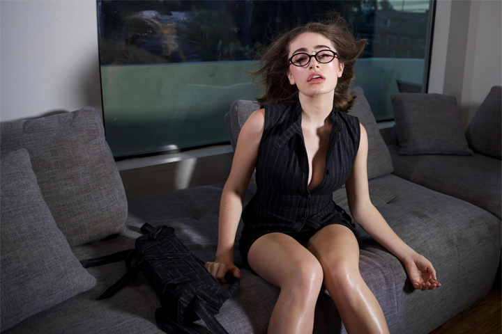
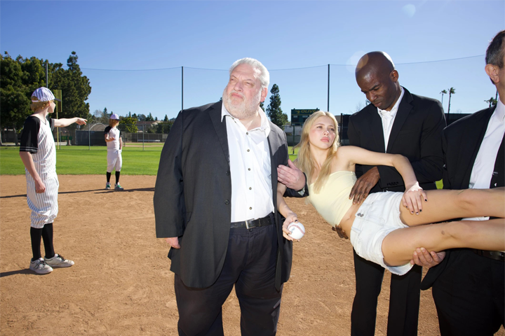
Research: Finally, I looked at Chessa Subbiondo's photography. I looked at her work through the lens of a quote from video essayist and academic Natalie Wynn, also known as ContraPoints, “Romance is for good girls, erotica is for sluts and pornography is for men”. Her photos have an uncanny feeling to them, are highly staged and clinical. I considered using photography in my own work, but also was interested in how I could create this engery and tension through typography and materials instead.
Rachel Sennott for Jared Ellner, 2024 Beanie Baseball, 2023 click to visit Chessa
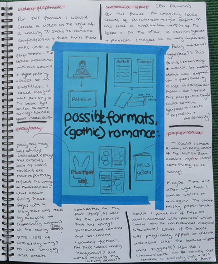
Development:
I began the design process with sketching
a series of possible formats and
considering the pros and cons of each.
Through this process, which is demonstrated
more thoroughly in my physical
folio (download available below),
I made the decision to create a
Playboy-esque
magazine whose pages
would consist of images in the style of a
reality TV, direct-to-camera confessional.
I would then apply the text as subtitles
overlaid on each image. I planned to print
and perfect bind the magazine at A4 size
on glossy paper, with approx. 50 spreads.
I had also hoped to colour the paper's
edge in bright yellow, and create a clear
plastic package for the magazine to sit in.
Development, Margot Shiel, 2025 click to download physical folio

Development:
Before undertaking any digital trials,
I made some brief notes detailing my
thoughts on some typeface options.
These, in combination with my
ongoing typeface research journal,
served as a guide I looked back on
throughout my design process.
I attempted to construct the magazine version of
the project twice, and produced a
rough version of a cover, but found myself
bored by the typographic elements in
this layout. I decided that I needed to try
something else.
I decided to go back and trial one of my
other inital ideas, and typeset the piece
as a letter. I then printed trials of this that
layered handwriting into the text. These
were more successful, and are in my
physical folio.
Development:
The next path that I trialed was taking
inspiration from the typographic treatment
in Fairy Tales.
I also decided to trial
a different approach to my photography,
as I needed something more exciting in
the interim before I could do a photoshoot.
I took flash photos of textures and
fabric in bright colours, including soft
toys, fur, wool and carpet. I used layering
and the wrap text tool, and played with
using Control and Control Cursive from
Commercial Type.
I also played with
using Comic Sans as a nod to the idea of
the text being instructional and didactic.
There was a period, according to my
English teacher mother, during which
educators were fervently encouraged to
use this “fun” typeface in order to make
their lessons more approachable...quite a
funny idea considering how unreadable Comic
Sans is as anything other than a title!
Development:
At this point I was feeling stuck and
unhappy with everything that I had
produced. I decided that I need to do
something physical, and for me that is
usually sewing and working with textiles.
I remembered my idea of applying type to
fabric and I felt inspired by a bright yellow
wool that I had photographed in one of
my previous experiments. Additionally,
Pamela herself is accomplished at needlework,
and I thought that introducing a
histroically feminine practice into my work
would give the piece a loved, handmade
feeling that would, in a way, also serve as
a reminder of Pamela's imperfections and
her humanity.
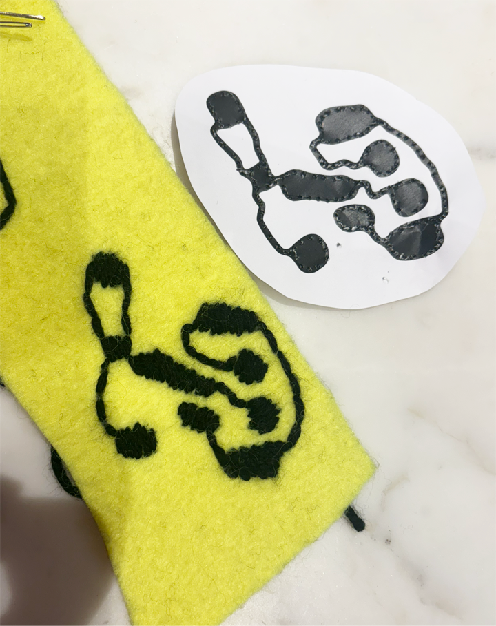
Thus, I used the technique of cartooning,
poking holes in a stencil and pushing pigment
onto the surface below, to transfer
a glyph onto the yellow wool I decided to
use. I then embroidered this with black
acrylic yarn. As I had a piece of fabric that
measured around 170 x 100cm, I decided
to plan my layout at B0.
The next step was to typeset a portion
of the text onto a B0 format. I decided to
look to paperback book pages, and the
original title page of the book to inform
the decisions that I made here. I trialed
many different typefaces, grids and ways
of layering.
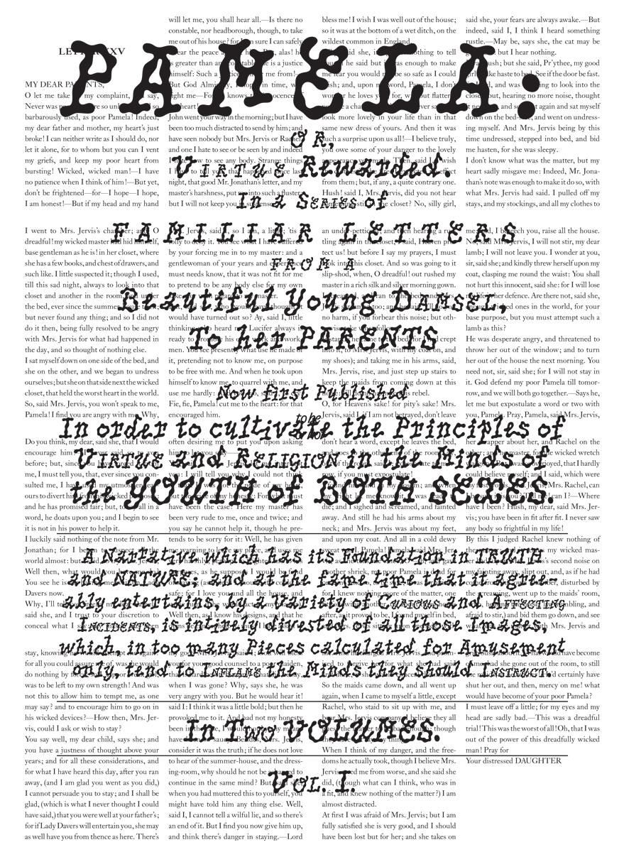
Final Outcome:
This is my final layout for my poster
and rug. The typefaces that I ended up
choosing are PicNic by Velvetyne, and
LTC Caslon.
PicNic, designed by Mariel Nils in 2022
is a bold, organic display typeface that is
designed to mimic a drop of oil running
down a picnic rug, the movement of
dappled sunlight on the grass, and it is
wobbly and wild. Originally designed for
French, PicNic is unique for its extensive
range of ligatures and while strange and
organic, it retains its legibility.
LTC Caslon is a version of the original
Old style, Dutch serif by William Caslon
and is a popular choice for booksetting.
Here, I have used it at 34pt in its regular
weight, in order to create a collection of
book pages that contain one of Pamela's letters.
This letter details an incident
where Pamela's employer hides in the
room she is sleeping in and accosts her in
her undergarments.
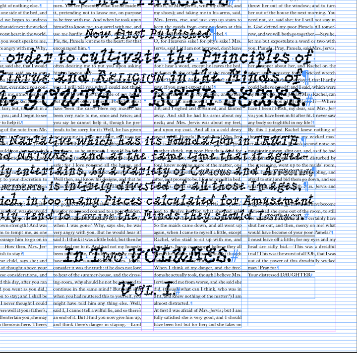
Final Outcome:
The grid specified here applies mostly to
the body text which is set in LTC Caslon.
The title page that is overlaid on top of
this was contructed, not through the use
of a grid and margins, but as an almost
exact replication of the first edition title
page of Pamela, or Virtue
Rewarded. This
text has then simply been centred over
the body text.
- Horizontal gutter set at 6mm.
- Vertical gutter set at
15mm, each body text box is A4 sized.
- Body text set in LTC
Caslon at 34 pt, regular.
- Chapter title set in LTC
Caslon at 40 pt, bold.
- Baseline grid every 24pt,
starting 0mm from the
top of the page.
- All margins are set at
50mm, top, bottom,
inside and outside.
- Central vertical gutter is
set at 30mm.
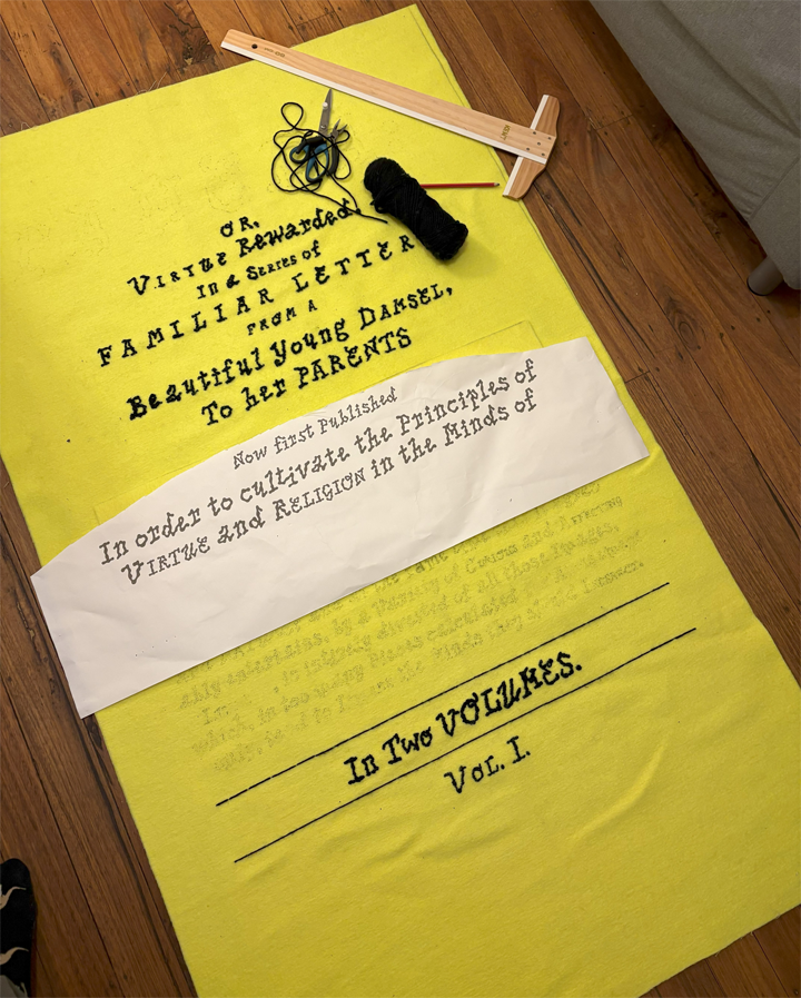
Final Outcome: Once I had determined the layout of my final piece, I had the top layer printed onto a B0 plan print, and the full piece printed on a B0 poster, 170gsm uncoated white. I them transferred the type onto my fabric using the plan print and embroidered the text.
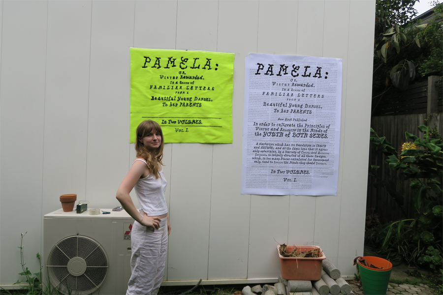
Final Outcome: Unfortunately, the embroidery was very time consuming and so I made the decision, after considering covering the centre section, to instead cut out the text that I did not have time to embroider, and piece the two halves back together. This decision made sense for the university submission that I produced this piece for, but I would love to go back and finish and replace this central panel that I removed. I don't think that this piece works as well, when the two wall hangings aren't the same size.